
Healthy Nurse Healthy Nation
UX/UI | Website Design
Helping the people who take care of us take care of themselves.
Healthy Nurse Healthy Nation is a site for nurses and nurse educators with a goal of protecting nurses’ overall wellbeing and preventing burnout. In-depth user research eventually led to a fresh new site design and strategy that positions Healthy Nurse Healthy Nation as an approachable, engaging resource for nurses of all backgrounds across 6 focus areas: mental health, nutrition, physical activity, rest, safety and quality of life.
Project Overview
The Problem
Nurses as a whole are burnt-out and more focused on their patients’ health than their own. Healthy Nurse Health Nation wants to extend their wellness resources to more nurses across the country to tackle this issue.
Project Goal
Redesign the Healthy Nurse Healthy Nation site to be mobile-first, improve usability, drive more conversions (new user signups), and improve user’s trust of the organization in order to grow the brand’s impact with nurses.
Results at a Glance
230% increase in site visits, including 11.6k new unique visitors.
Completion rate for sign up process increased from 18% to 73%.
Improved experience and design of the site led to an average visit duration increase of 137%, and an average of 9.3 additional pages visited.
Nurse Wellbeing Facts
51%
of nurses in the United States who aren’t getting the recommended 150 minutes of exercise per week.
90%
of nurses in the United States who aren’t eating the recommended servings of fruits and vegetables.
5.8%
Average yearly increase in combined depression and anxiety symptoms in nurses since 2017.
68%
of nurses prioritize the health, safety and wellness of their patients over themselves.
6.77
Average hours of sleep per night.
Identifying Site Pain Points
Need for Content Strategy
A main goal for this project was to increase overall trust and engagement with Healthy Nurse Healthy Nation by delivering robust content in each of the 6 key focus areas: Rest, Nutrition, Physical Activity, Mental Health, Safety and Quality of Life.
To help do this, years of wellness blogs that had previously been gated behind a logged-in version of the site were made accessible on the main site. The team hypothesized that this would provide validation to users, opening the funnel for more sign-ups.
Mobile Design was an Afterthought
Stakeholders wanted to prioritize the mobile experience in order to be a resource to more nurses on-the-go and in younger demographics.
High Bounce Rate on Sign Ups
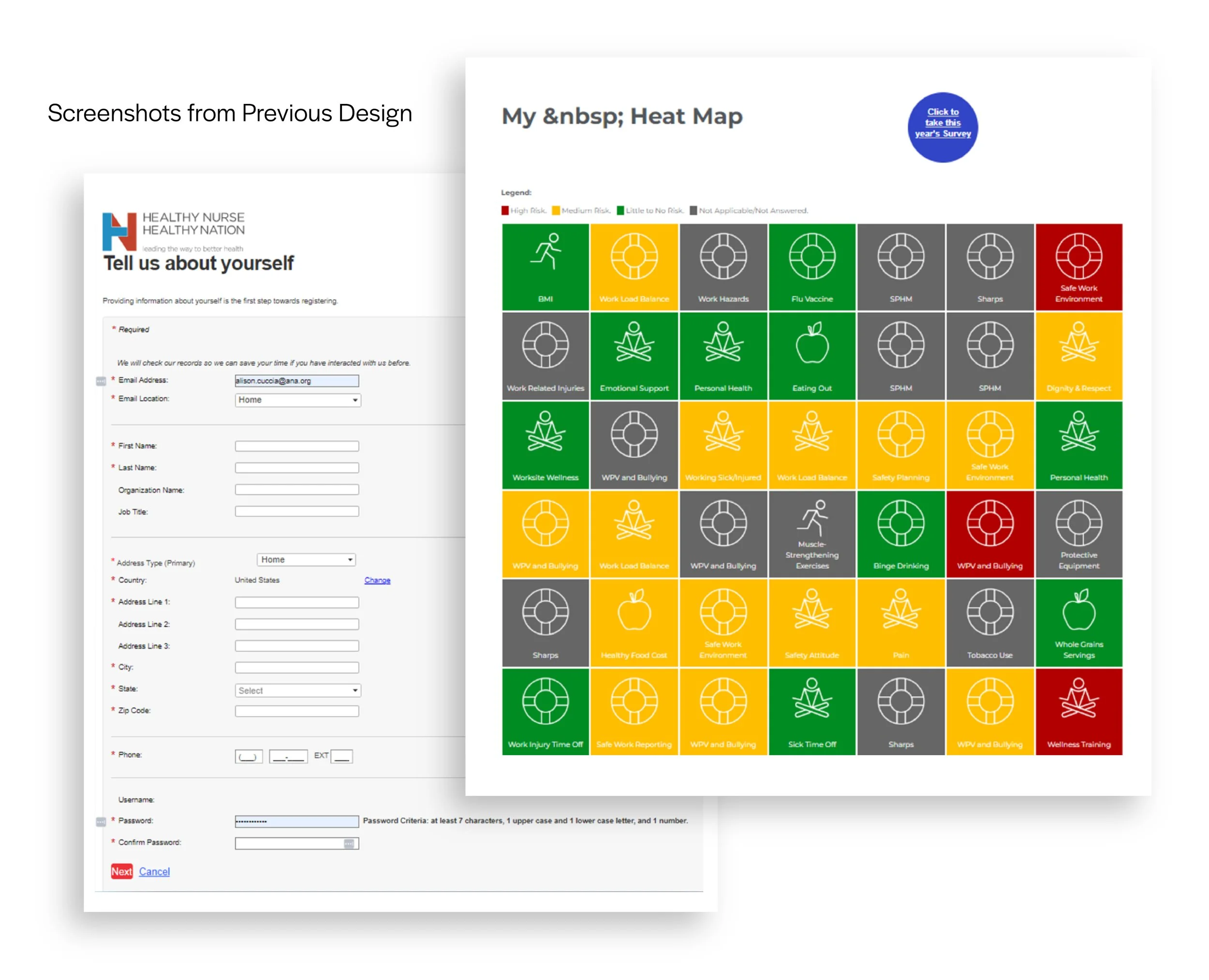
The old sign-up form used on the site was cumbersome, with more than 16 required form fields to complete. As a result, more than 80% of users didn’t complete the process.
Confusing Wellness Assessment Results
Once a user creates a new account, they’re invited to take a personalized wellness survey that tests their current lifestyle habits in the 6 focus areas. Results were then presented in a “heat map” format, but because there were so many different sub-sections, it was difficult for users to gain a big-picture understanding of their health.
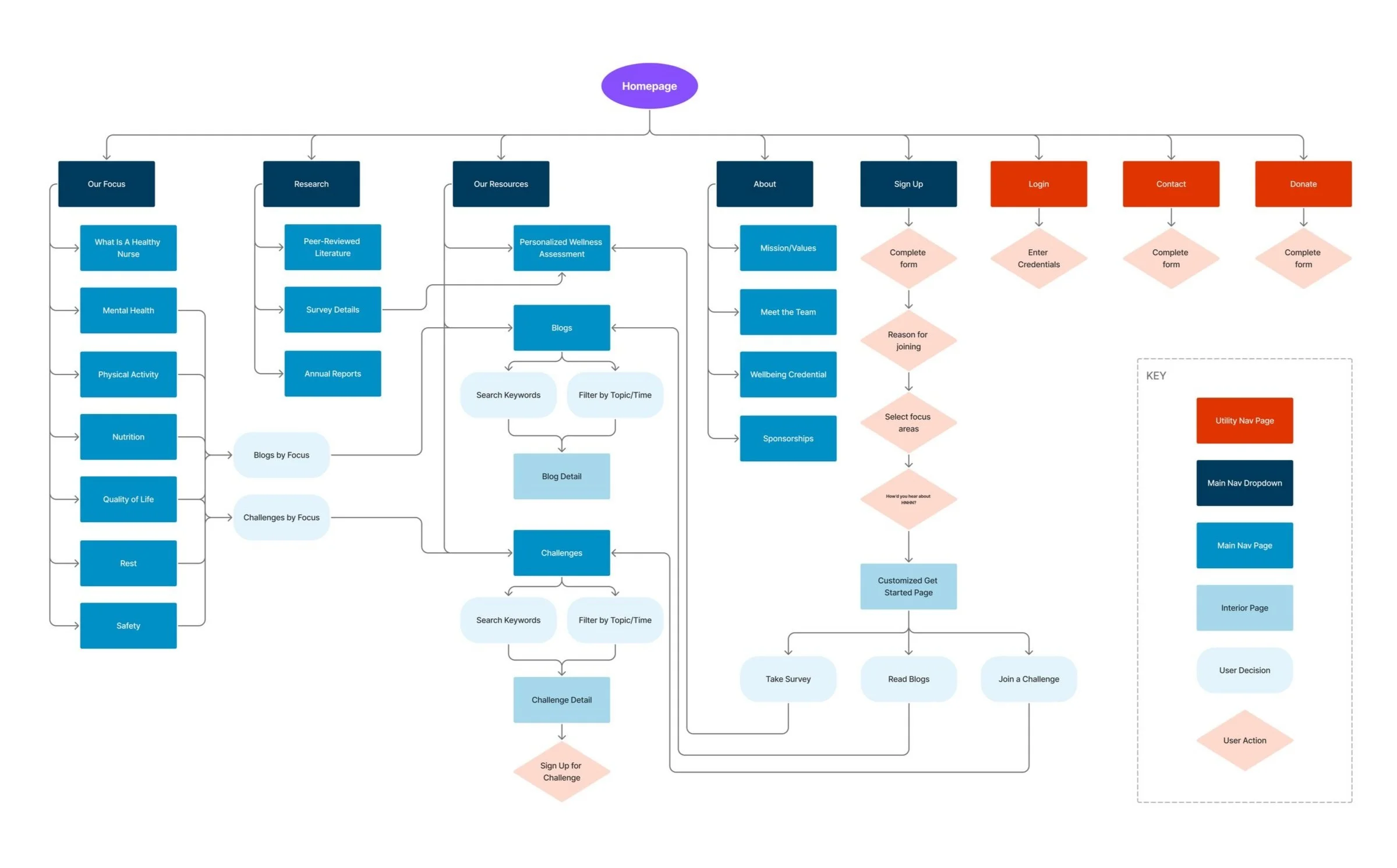
Site Map and User Flow
Once the initial problems and goals were established, the team began the research phase to better understand our users and their behaviors. This included persona development, taxonomy assessments, a card sort and focus group interviews.
The new site framework was then structured and shown in the following diagram. The “Our Focus” section in particular helped the team visualize how to structure blog content around the 6 focus areas (mental health physical activity, nutrition, quality of life, rest and safety).
Brand Language and UI Design
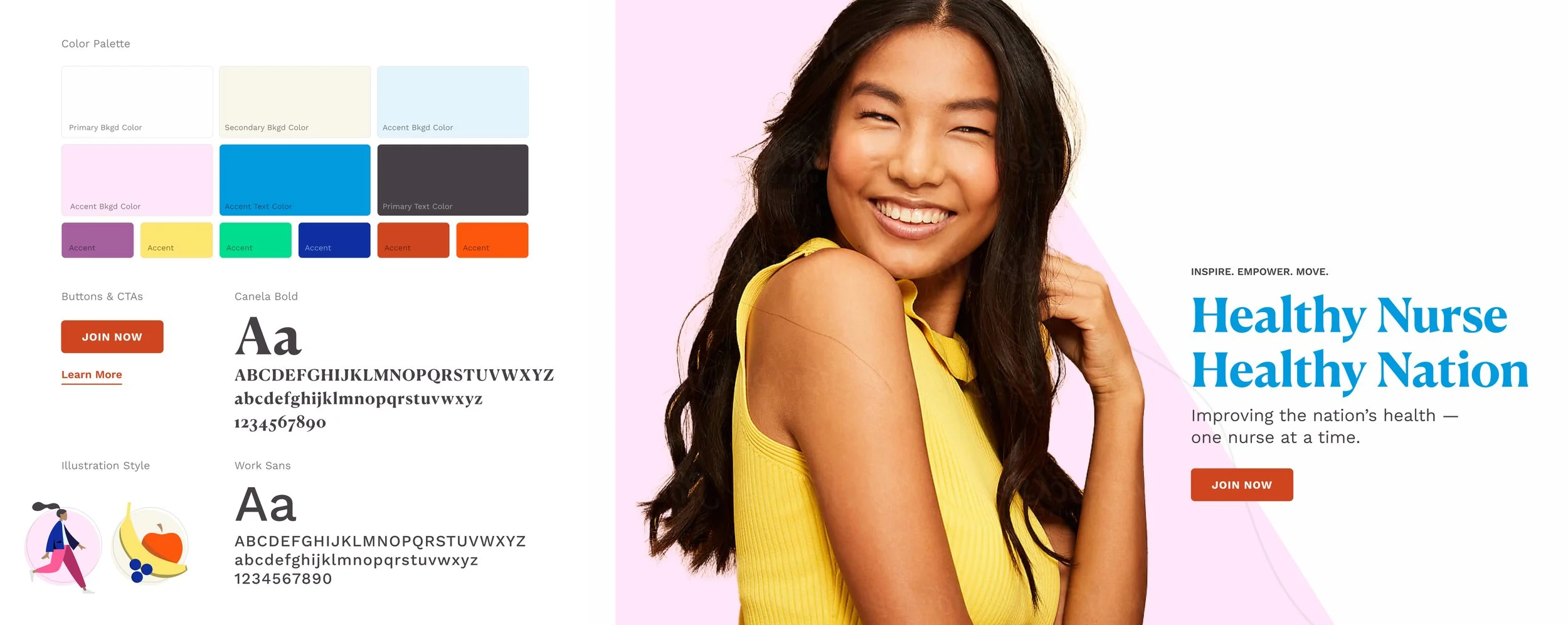
In order to feel more like a lifestyle site and appeal to a younger generation of nurses, a new brand language was developed. The updated color palette includes a few key colors from the existing logo and parent organization, but the addition of some bright, colorful shades makes the site feel much more youthful, inviting and fun. Illustrations were introduced to represent the six key focus areas for content, and more negative space helps the user not feel overwhelmed in potentially copy-heavy areas.
Below is the initial stying proposal selected by the client, followed by the final UI elements guide.

High-Fidelity Screens
The following sections showcase the final designs of key flows in a mobile format.
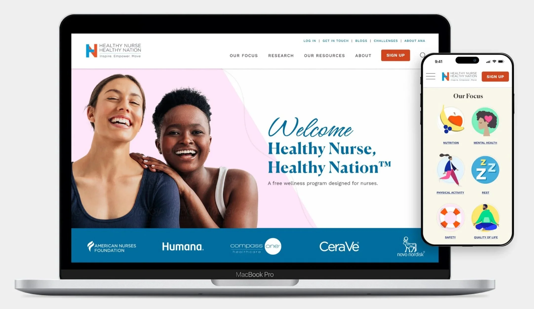
Value-Driven Homepage
The homepage of the site is an opportunity for users to learn more about the organization’s goals, see the value joining Healthy Nurse Healthy Nation provides to nurses, and be introduced to challenges and blogs related to their wellness.
Focus Landing Pages
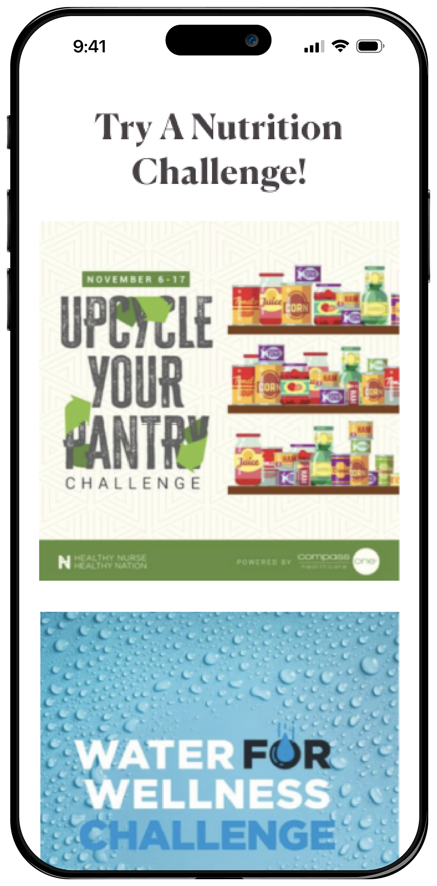
Each of the six focus areas (mental health, physical activity, nutrition, rest, safety and quality of life) now have a specialized landing page where blog and challenge content related to that area can be featured.
One key change that was made to blog cards compared to the old version was removing individual “read more” buttons from each card and instead making the entire card linked to that blog. This reduced the amount of visual noise and allowed for a more streamlined experience.

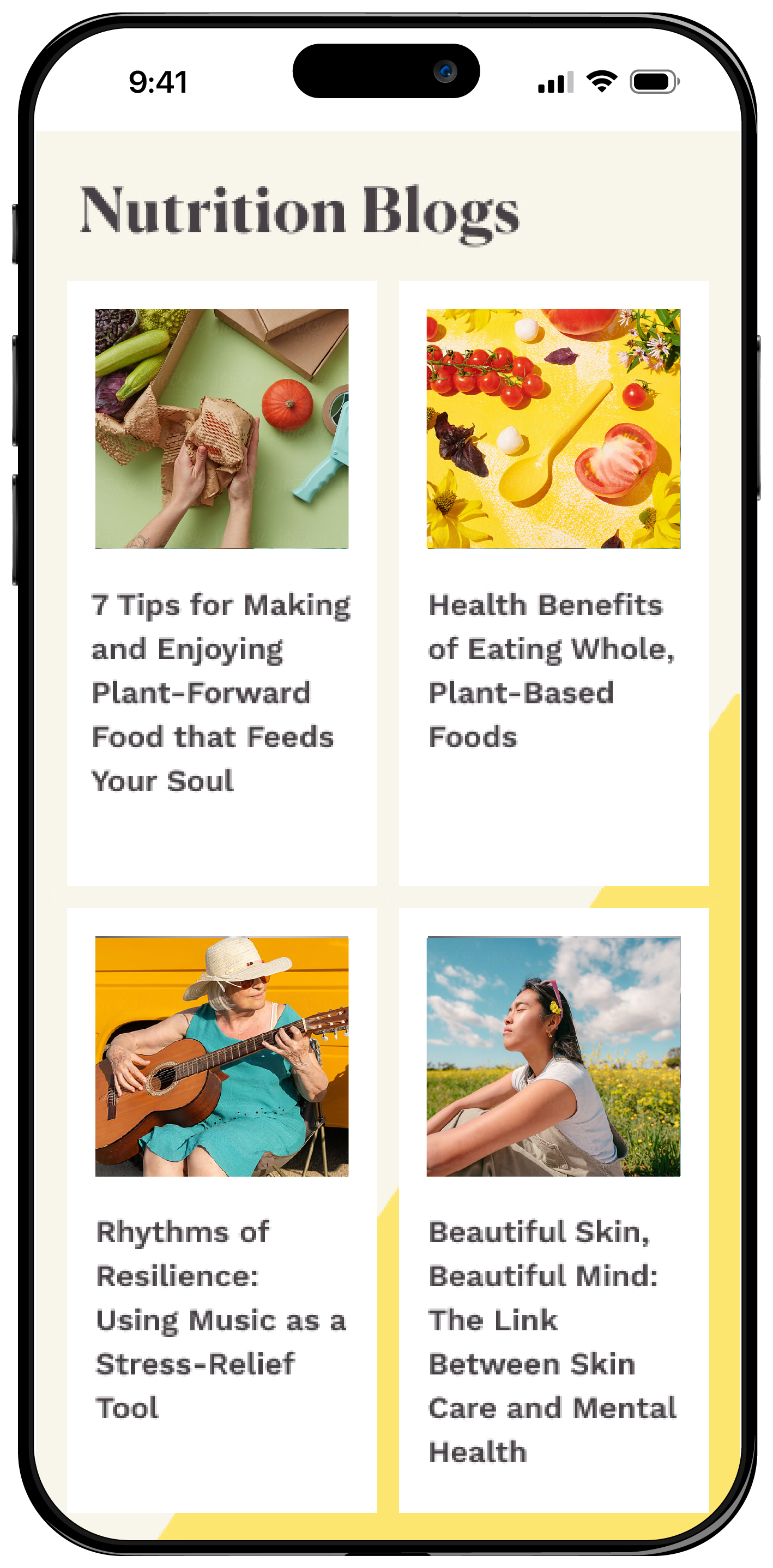
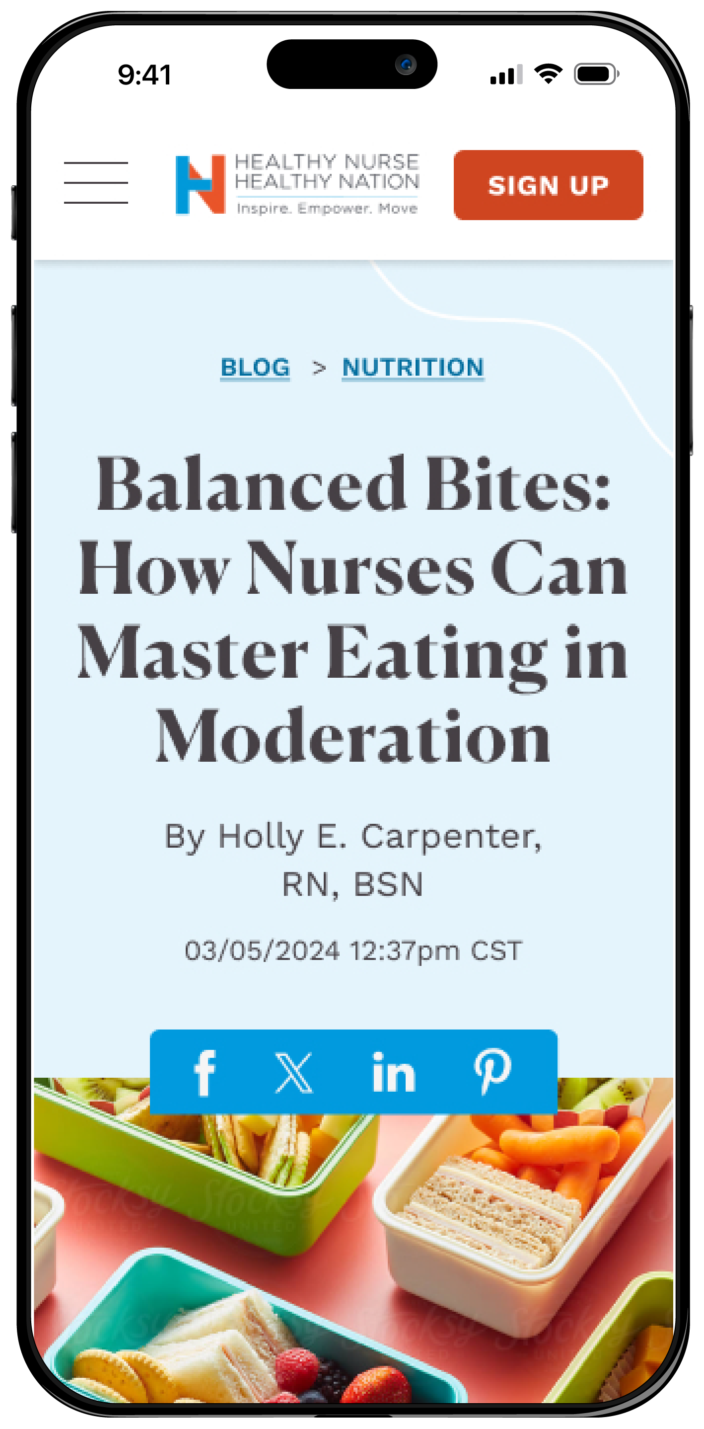
Engaging Blogs
The “Blog” section contains articles organized by each of the 6 focus areas. Photography guidelines were provided to the client for colorful, simple stock imagery that would align with the brand language of the rest of the site and excite users to learn more.
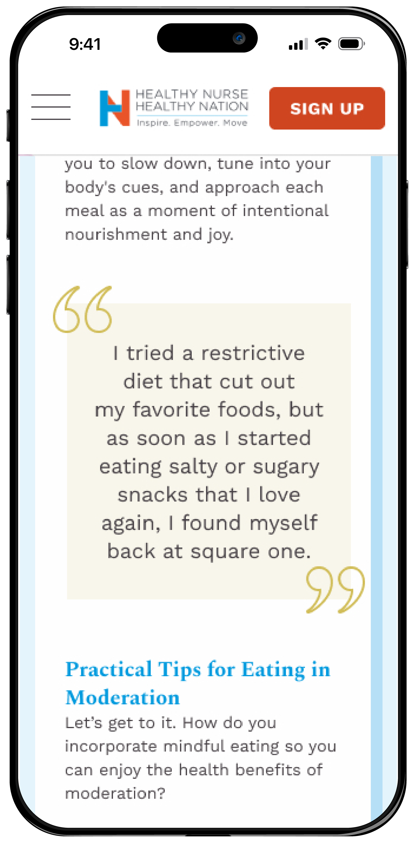
Large text blocks are broken up by secondary imagery, pull quotes, and header styles to make the content enjoyable to read through.

Streamlined Sign-Ups
Collaboration with both internal and client development teams allowed us to simplify the sign-up from 16 required fields to only 6, greatly reducing the bounce rate from this section.
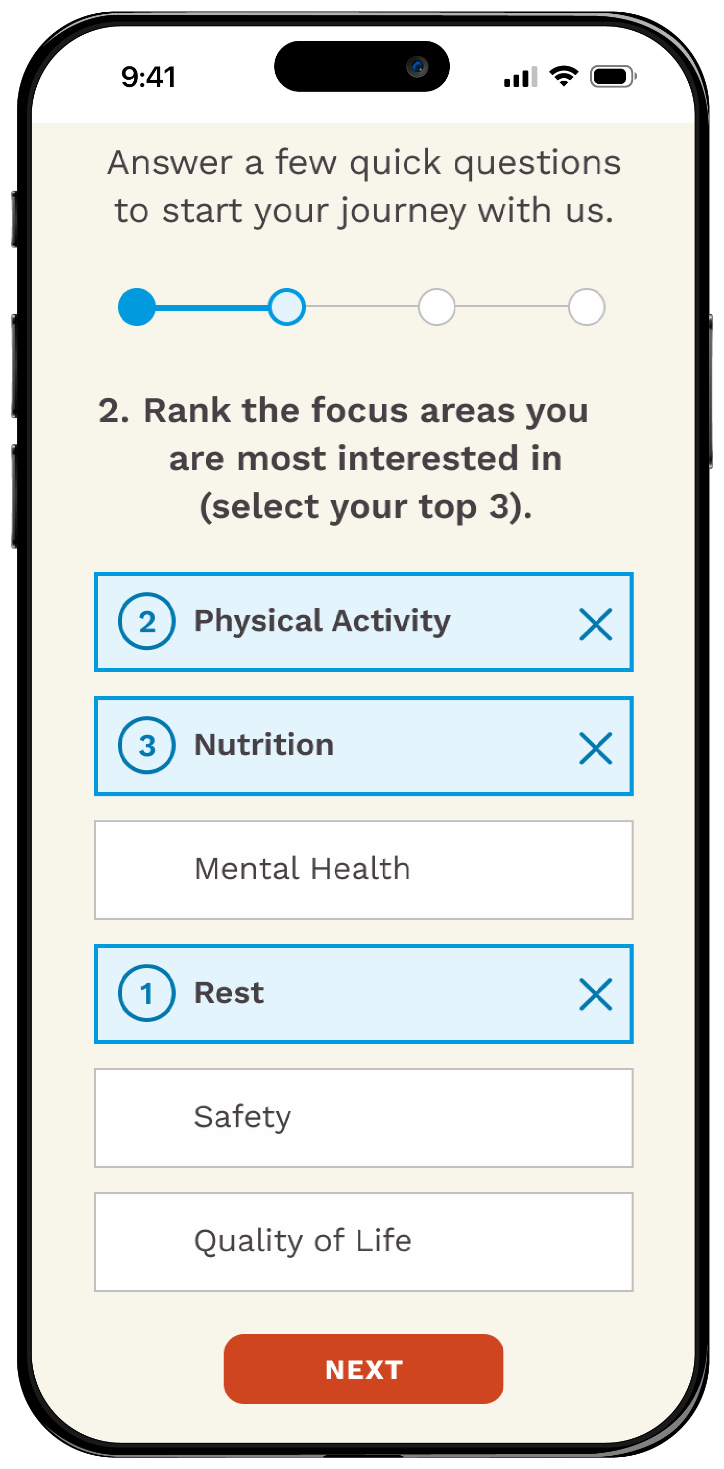
In order to provide users with a more tailored experience, an quick optional survey was added after signing up. This allowed the user to select the focus areas that mattered most to them and provided valuable user insights to the client team in creating future content.
Once the user finishes the survey, they are directed to a custom page with content tailored to their responses, and a suggestion to take the wellness assessment.


Dynamic Wellness Assessment Results
In order to align with new user behaviors, the wellness assessment results were re-imagined as parts of a circle, similar to Apple’s Fitness Rings. This represents the user’s wellness as more of a journey to be taken.
The same “red, yellow, green” color system was improved from the previous version to allow for easy visual scanning. An overall numeric score out of 100 was also provided.
Users can now click each of the notes related to a focus area to learn more about their score and tips to improve it.

Redesign Impact
Results are compared with the previous site over a 6-month period.
9.3
Average increase in pages visited per session.
137%
Average visit duration increase.
230%
Increase in site traffic.
11.6k
New unique site visitors.
303%
Increase in completion for new user sign ups.
53%
Reduction in bounce rate.
Created with Brightfind Inc.