Member Junction
UX/UI Design | Enterprise SaaS
Organizing data for associations
Member Junction is an AI-driven common data platform designed for associations. It empowers its users to utilize and organize their data effortlessly to help drive organization decisions.
Project Overview
Project Goal
Create a highly intuitive and polished user experience that would increase user engagement in v2.0 and improve validation to prospective customers, ultimately leading to more product sales.
Problems
The initial version of the product was created without any consideration for a the user experience. As a result, user engagement was low.
The associations who would be the primary customers of this application would likely have hundreds (if not thousands) of data “views” that would quickly become overwhelming if not carefully organized.
Creation of tabbed pages within the interface quickly became overwhelming to the user experience.
The agentic SkipAI needed to be integrated throughout the experience for easy access to report generation.
Solutions
Conducted user testing on the existing product to uncover pain points, then developed new wireframes and prototypes for further testing and validation before launching the new version.
Introduced file organization and way-finding systems to put users’ files within easy reach.
Reduced the amount of new tabbed pages by introducing dialog windows for temporary actions instead, and created a way to simplify necessary tabs.
Made SkipAI a consistent icon on almost all pages and created a way to save the chats within the system.
Impact
V2.0 showed a 34% increase in user engagement (based on time spent interacting with the product).
Product sales grew by 42% after implementation.
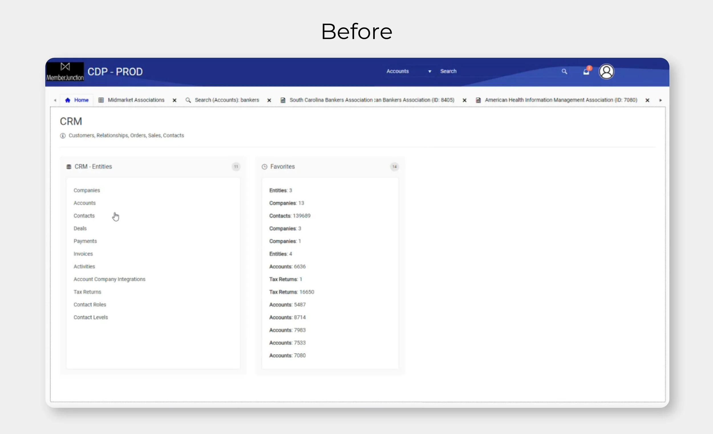
Identifying Initial Pain Points
The original version of this product was built by a group of stakeholders who were also developers. Therefore, no in-depth user research or usability tests had been done. The stakeholders had an idea of what problems existed, but I conducted interviews with a small group of users to confirm the biggest problems:
Lack of Organization
Because this product was marketed to mid and large-size associations with hundreds (if not thousands) of data sets, users complained of not being able to easily find and organize their data views.
Need for AI-Generated Reports
A key selling point of the product was AI-generated reports based of data pulled from the users’ other applications. But the SkipAI agent was difficult to access in the old interface, leading to low engagement.
Overwhelmed by Tabs
Almost every user action resulted in the creation of a new page tab, which quickly filled up the available space and made locating certain tabs difficult.
Confusing Interface
Overall, the experience felt clunky and disjointed and the generic UI the developers had adopted from a third party wasn’t helping. As one interviewee said, “it feels as complicated as operating a plane instead of sleek and intuitive like a Tesla”.
Organizing the User Experience
To visualize the overall experience, I began by creating user flows. This allowed the stakeholders and I to see any potential gaps or awkward dead-ends in the experience, as well as how the three primary data visualizations within the application (data views, AI-generated reports, and dashboards) could all be connected.
During this phase, another key feature was determined: the ability to have multiple users within the application, which highlighted even more the need for file organization. This also gave us the opportunity to include a “share” feature.
Early Wireframe Iterations
Next, I moved on to low-fidelity wireframes. These were used for further usability testing and stakeholder presentations, and allowed me to determine the viability of solutions. For example, a secondary slide-out navigation was introduced as a way-finding tool to easily see how views are organized within user-created folders, which was implemented later in the prototypes after favorable user tests.
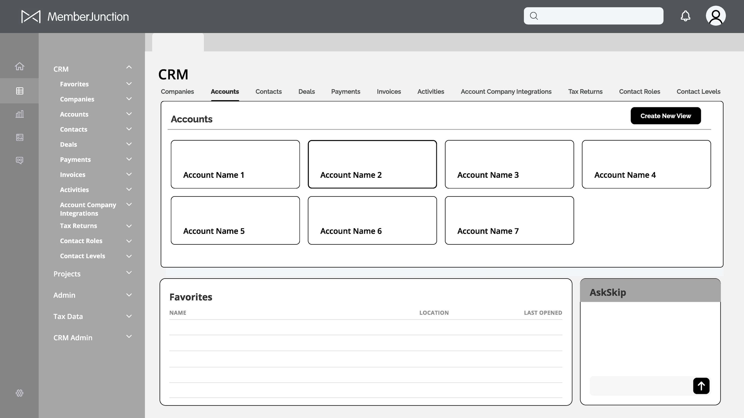
However, the placement of SkipAI as a slide-up window in the lower right corner was discovered to be too difficult to see when collapsed and not large enough for report generation. Instead, that feature was reimagined as a floating icon that expands into a screen takeover in the high-fidelity prototypes.
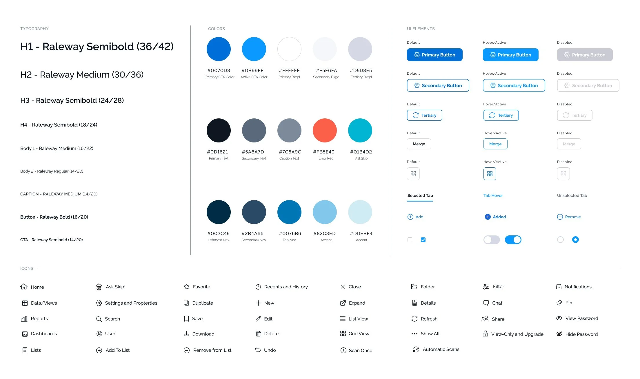
UI Design System
Because v1.0 was created with generic elements from developer sources, it was important to create a unique UI system for consistent, memorable design that would evolve with future updates. I created the following system of fonts, colors and elements to provide this product with a professional yet modern look and feel.
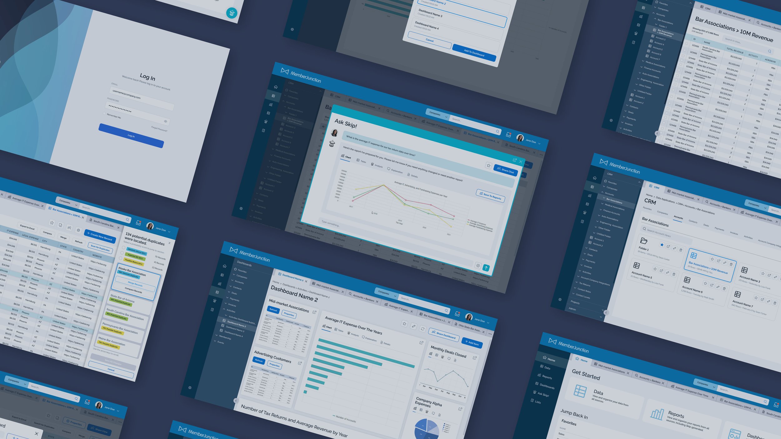
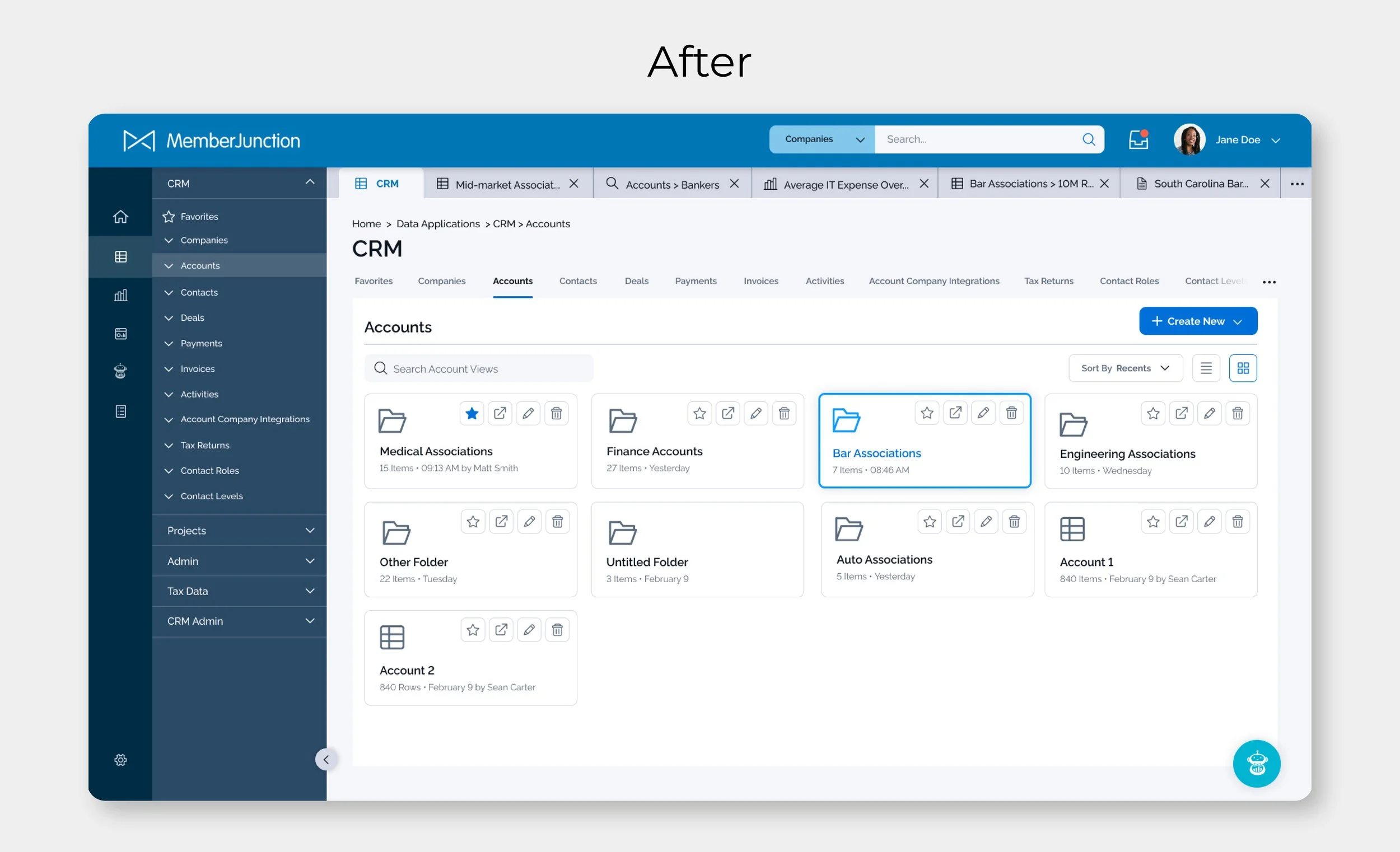
High-Fidelity Mockups
The following sections showcase typical user actions throughout the application.
Key Updates:
Reduced the amount of automatically created tabs by using popup windows for temporary actions.
Addition of side panel navigation to easily click between different data sets and see how they’re organized within folders.
SkipAI feature is better integrated into the user experience throughout the app.
Added additional UX features such as filters, search, sharing capabilities, and icon/list toggles.
Added the ability to scan for duplicate records throughout the users’ data and resolve through merging.
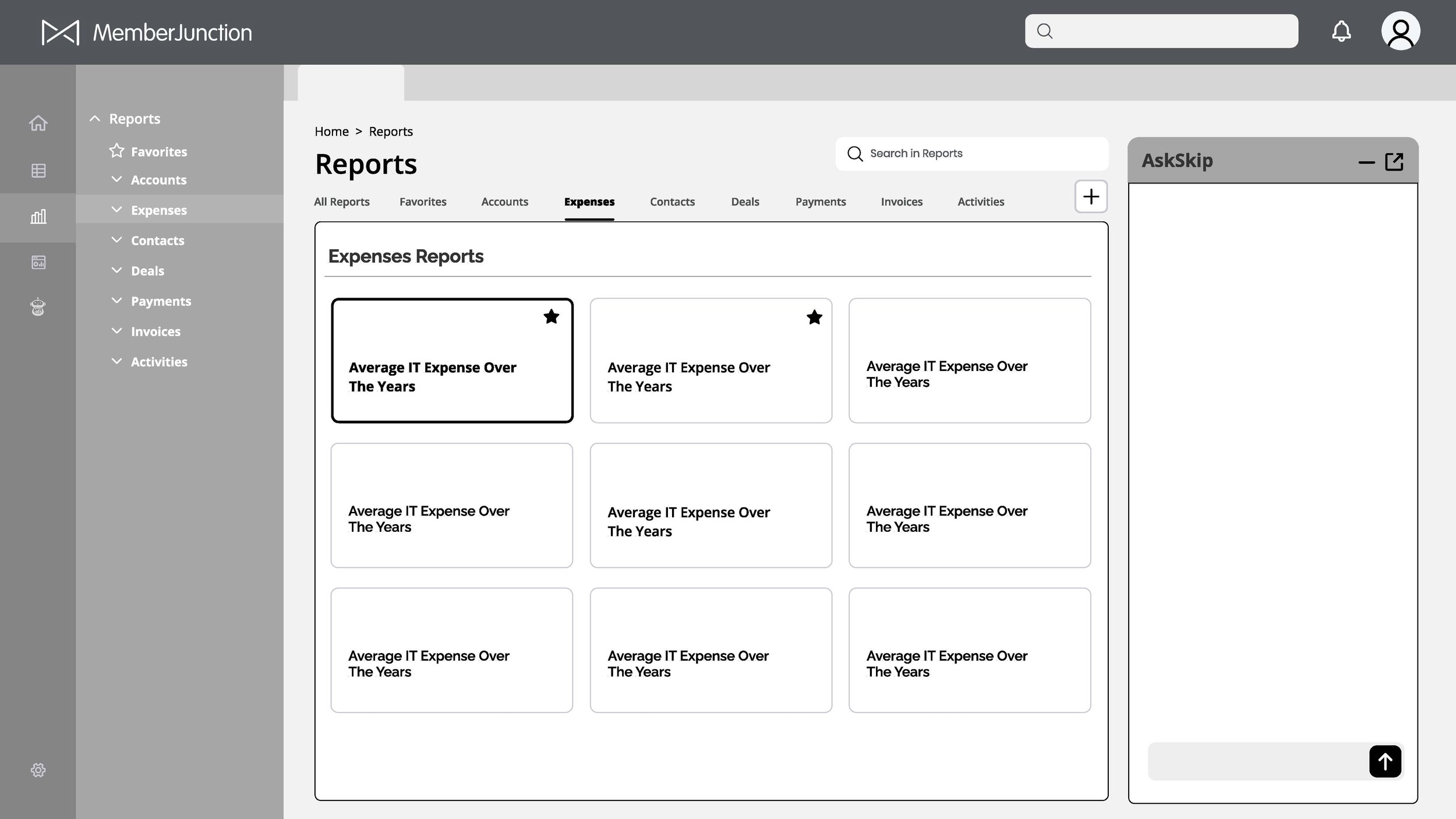
Getting Started with Tab Organization
Once the user is logged in, they can choose quick links at the top of the home screen for data, reports or dashboards, open a favorited item, or query SkipAi. Additionally, tabs were set to a minimum width and functionality was added for additional tabs to appear in a dropdown window to the right.
Dialog Windows for Temporary Actions
Examples of several actions the user can take in a data view, including viewing the properties, sharing with other users, and adding to previously-created lists. These actions previously led to new tabs being created but now are treated as temporary windows, allowing the user to focus on their own data.
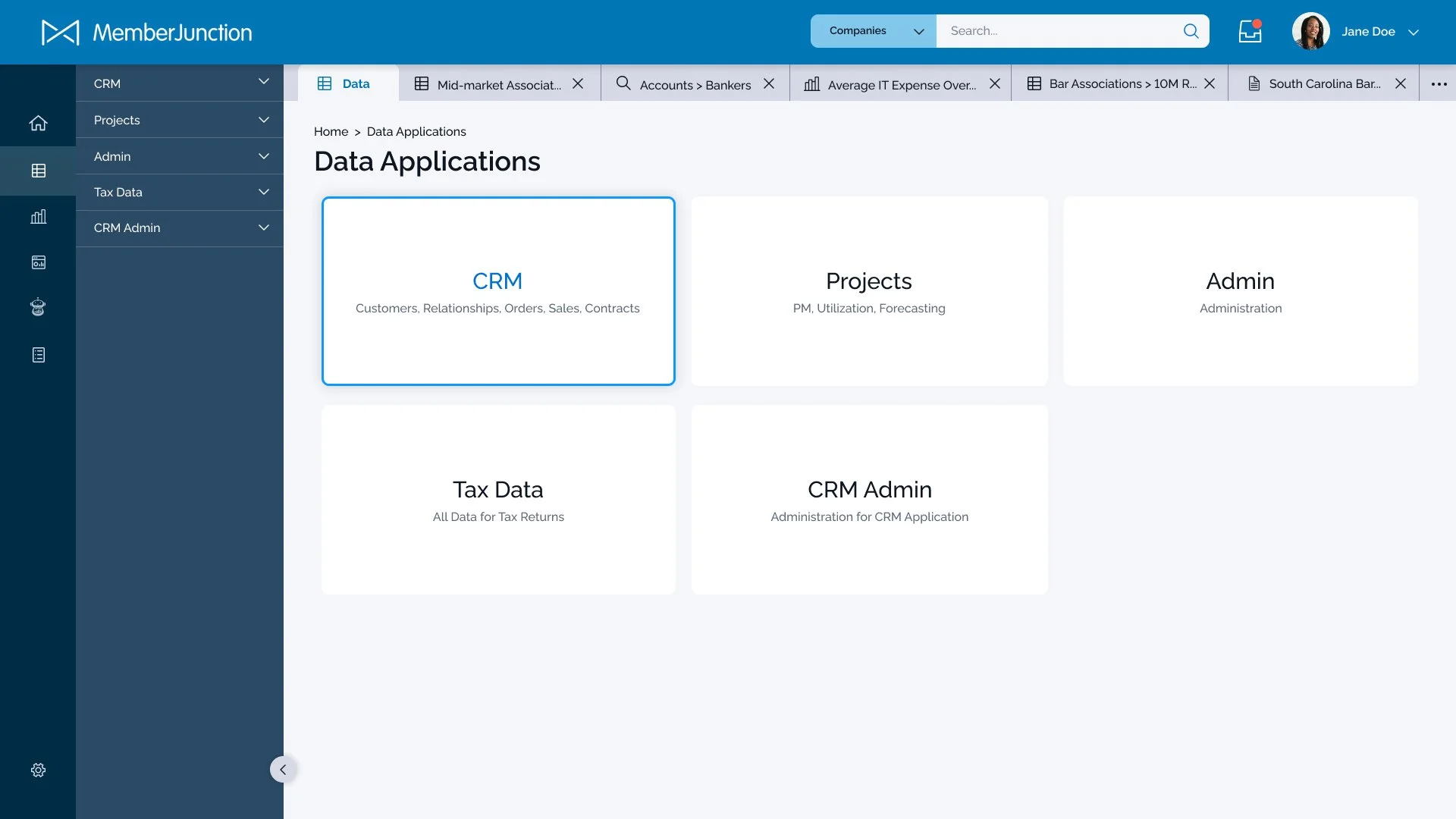
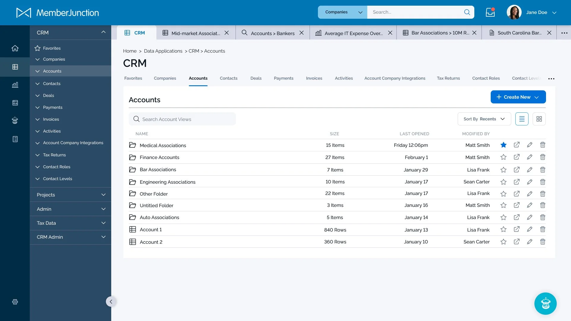
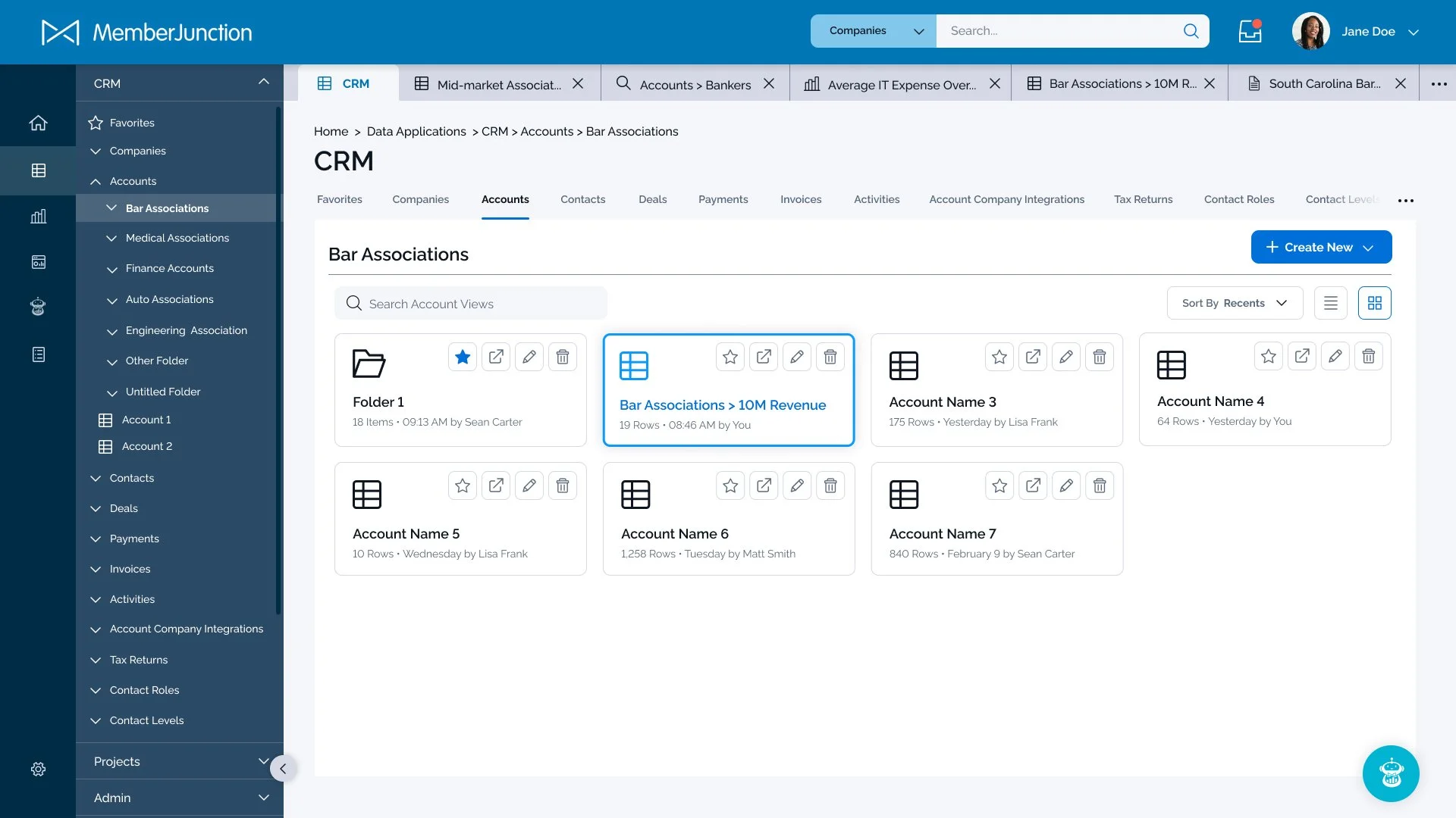
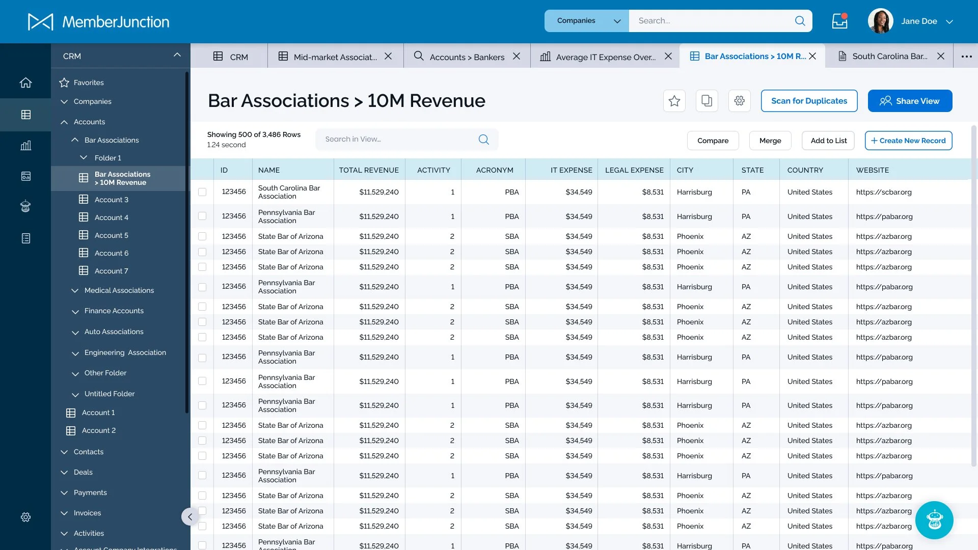
Exploring the Data through Folders and Navigation
Clicking one of the main menu items on the left navigation panel collapses the panel and opens a secondary column to drill down through various sets of data the user has previously integrated or added. The data is organized by application, favorites, recents, and any number of folders and subfolders the user has specified. Files are also viewable in either list or table format depending on user preferences. A large, clear “create new” button allows the user to quickly create a new folder, data view, or duplicate from an existing view. When available, a floating icon for SkipAi appears and can be clicked to open a SkipAi dialog window.


SkipAI Report Generation
SkipAI is now almost always available to the user by clicking on either the floating button icon and opening a chat window, or by clicking the “Ask Skip” menu item in the main navigation. The latter allows the user to easily scroll through past and favorited chats. Both methods have the option to share the chat with another user, or save a generated report.
Once a report is generated, it can be saved to the Reports section and/or added to a Dashboard.

Scanning and Merging Duplicate Records
One feature that quickly became recognized as missing from the initial product was the ability to automatically scan and resolve duplicate records across data views. With large organizations and multiple users, the chance than a 2 instances of the same record could exist was high. Therefore we dove into creating a new user flow to resolve the issue.
The solution categorizes records into three groups based on the probability of being a duplicate record. Users can jump to those sections quickly by selecting the options at the top of the slide-out rail, or can use the arrow keys to check through records individually.
The records for each review period are highlighted within the view for the user to compare. Once the user finishes reviewing, they click “merge records” and the system will automatically remove the duplicates.
The Impact
34%
Increase in user engagement compared to previous version.
42%
Increase in product sales to new customers.
“Questions that once took days to answer will be resolved in seconds, allowing our team to be more strategic and responsive to member needs.”
— Catherine Zaic, Senior Director of Information Technology at Council for Advancement and Support of Education
Created with Brightfind Inc.