Member Junction Application
UX/UI Design
Organizing data for associations
Member Junction is an AI-driven common data platform designed for associations. It empowers its users to utilize and organize their data effortlessly to help drive organization decisions.
The Problem
When I was approached to work on this project, the backend framework of the platform was already in development. However, the product stakeholders acknowledged that they hadn’t given consideration to the overall user experience or interface yet. The product worked for the most part, but the experience was convoluted and the interface boring. As one interviewee said, “it feels complicated like operating a plane instead of sleek and intuitive like a Tesla”.
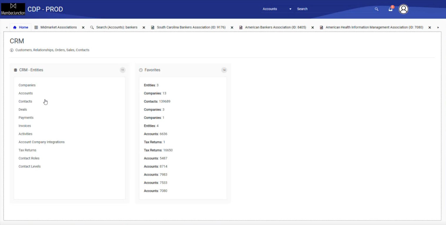
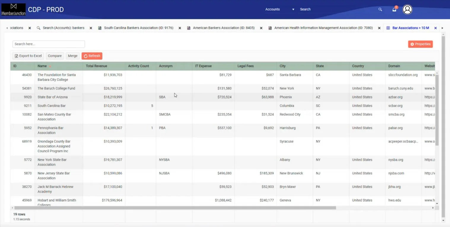
Screenshots of previous layouts
After conducting several interviews with the stakeholders and user experience tests of the existing product, some key problems were highlighted.
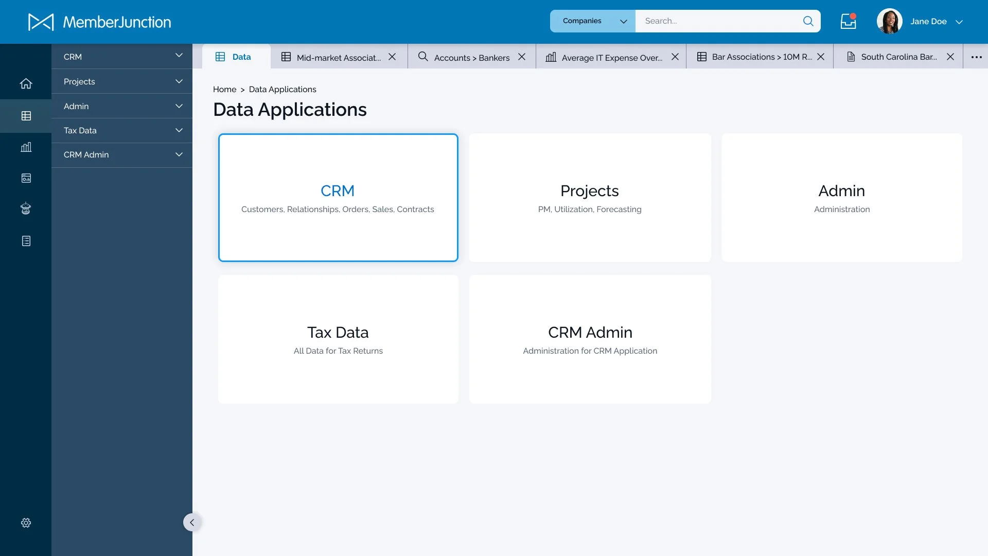
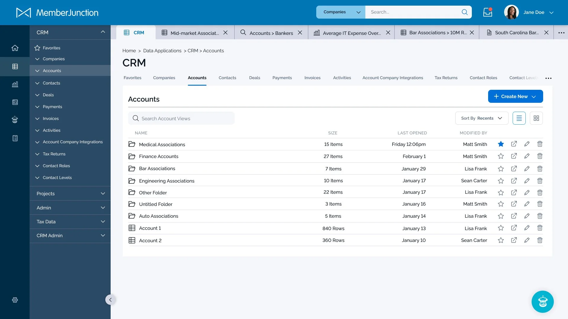
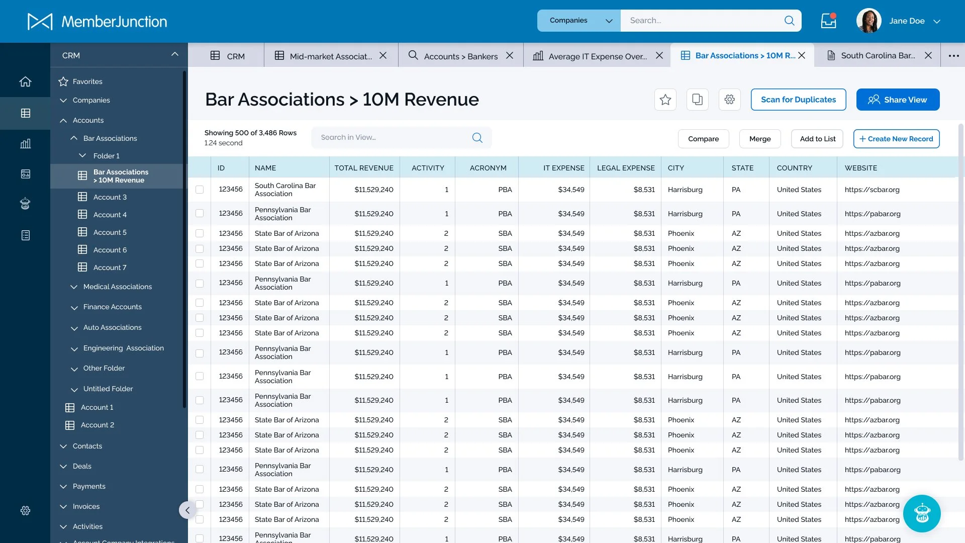
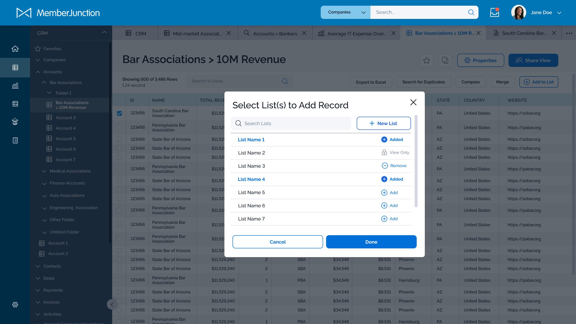
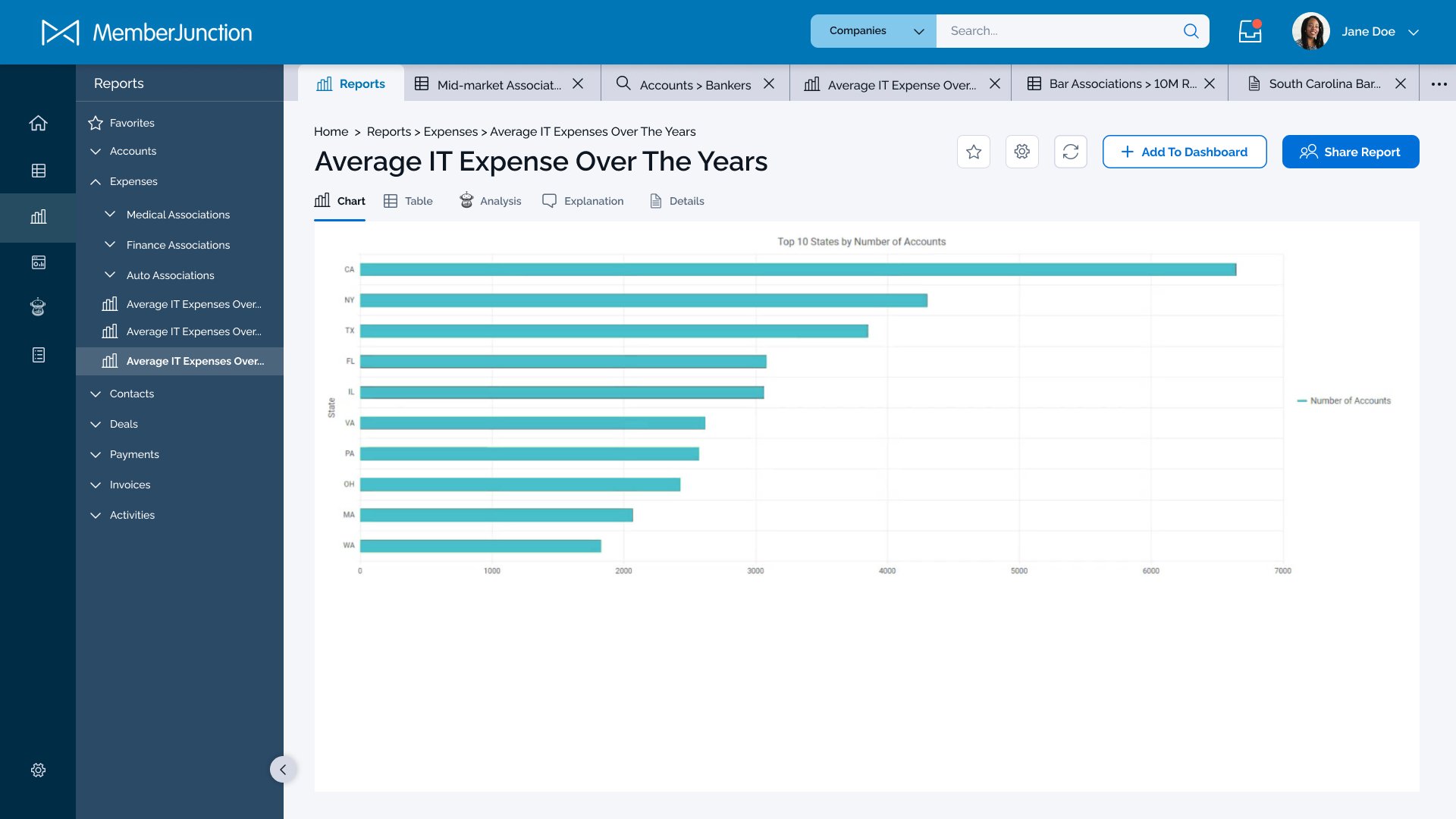
The associations who would be the primary customers of this application would likely have hundreds (if not thousands) of data “views” that would quickly become overwhelming if not carefully organized. Adding to the overwhelm was that almost any action the user took would result in a new “tab” being created that would take them away from the ability to navigate back to a previous screen. Lastly, an important goal from the stakeholders was to put the AI-bot SkipAI within easy reach whenever the user needed to generate a report or pull answers from complex data sets.
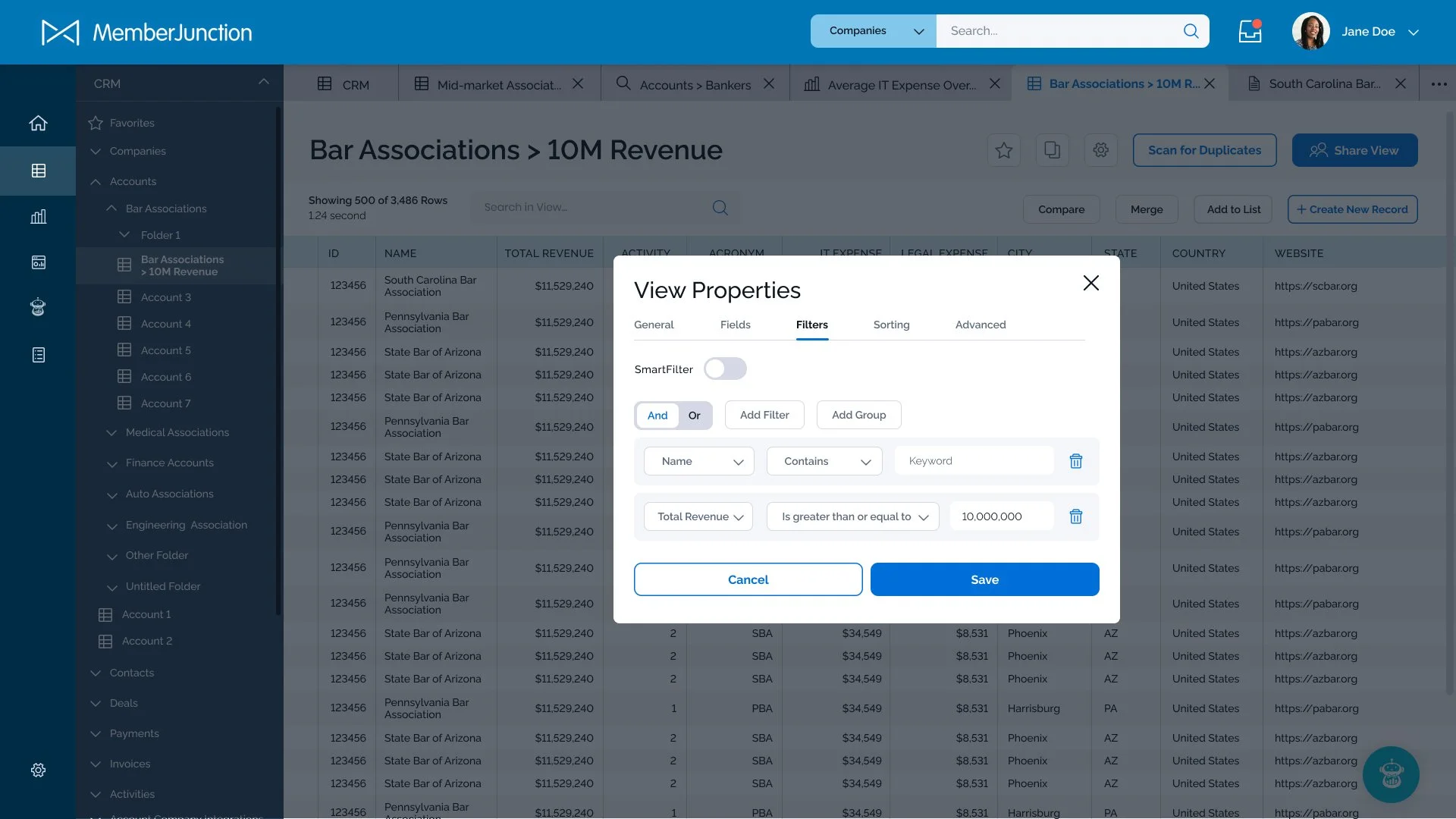
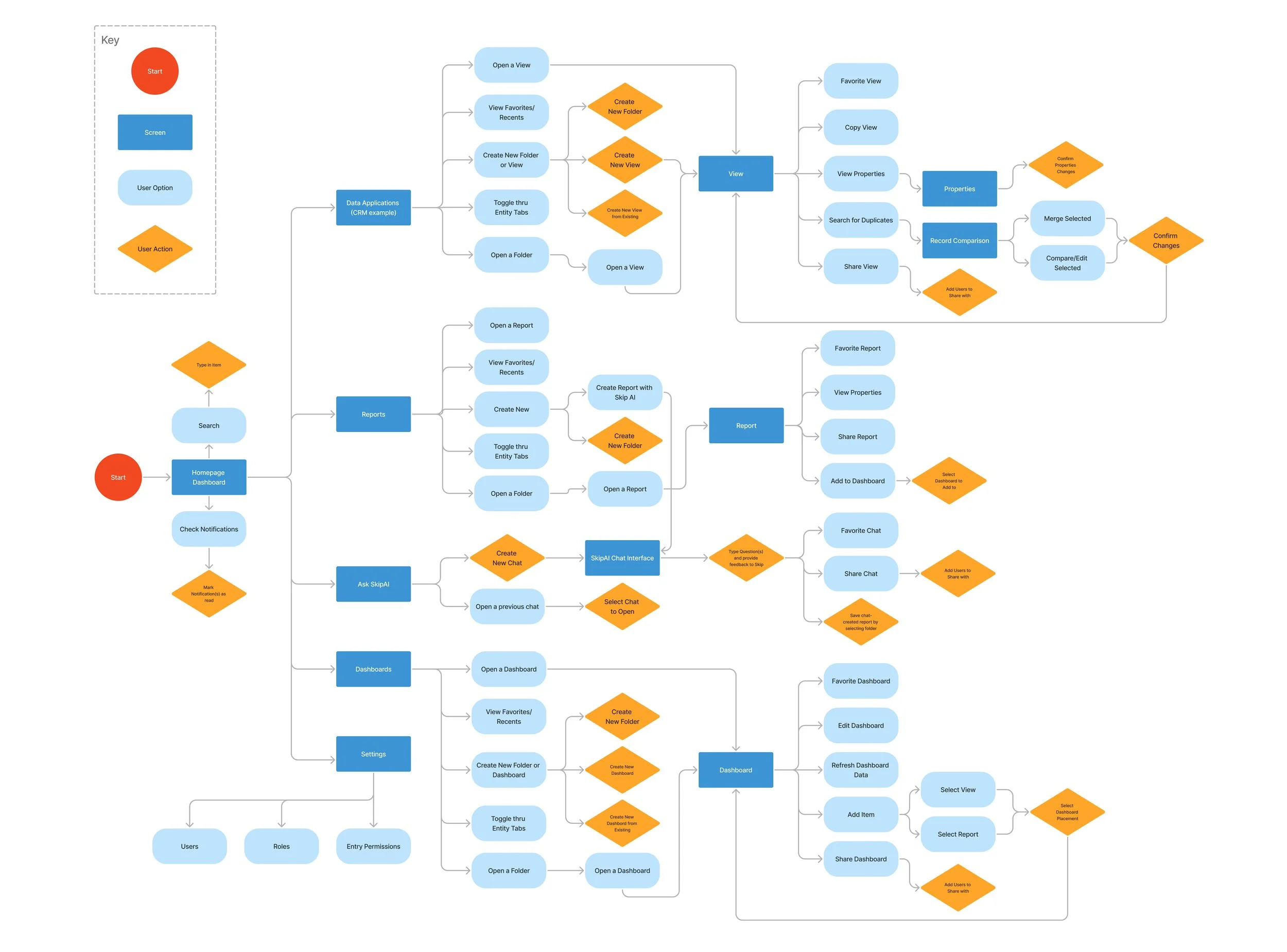
Organizing the User Experience
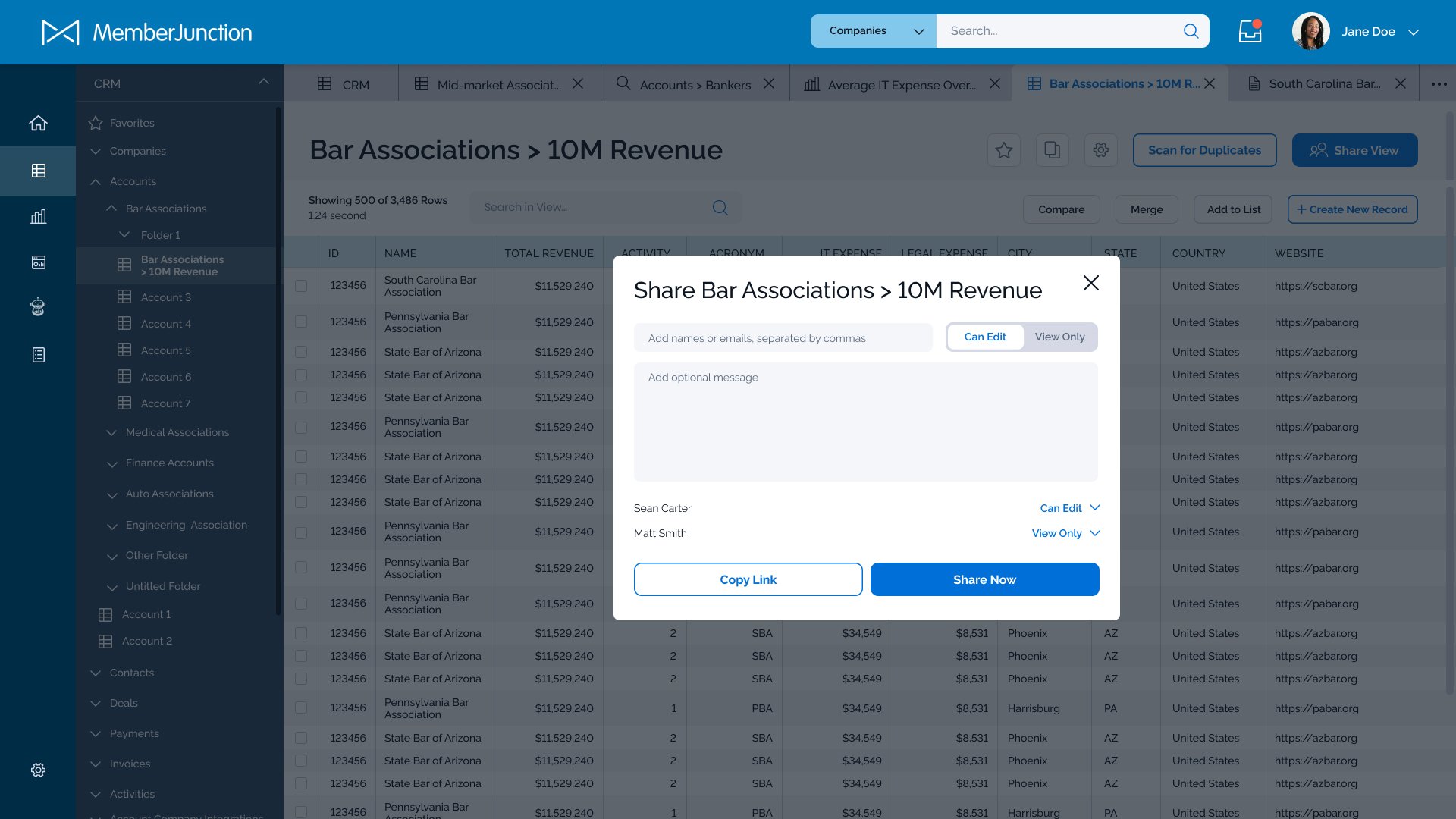
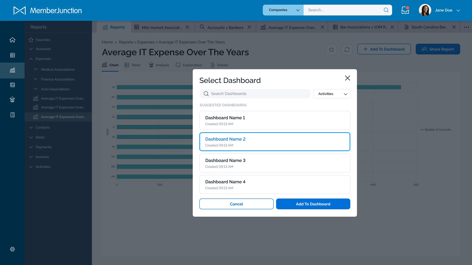
To visualize the overall experience, I began by creating user flows. This allowed the stakeholders and I to see any potential gaps or awkward dead-ends in the experience, as well as how the three primary data visualizations within the application (data views, AI-generated reports, and dashboards) could all be connected. During this phase, another key feature was determined: the ability to have multiple users within the application, which highlighted even more the need for file organization. This also gave us the opportunity to include a “share” feature.
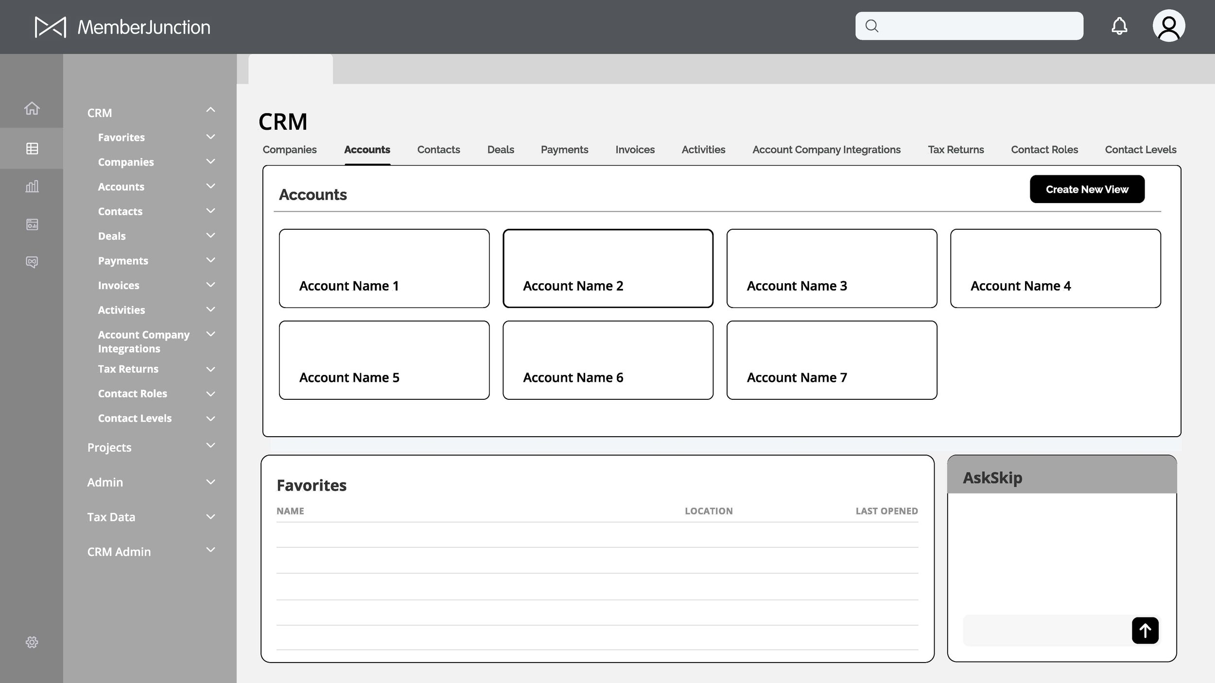
Wireframing
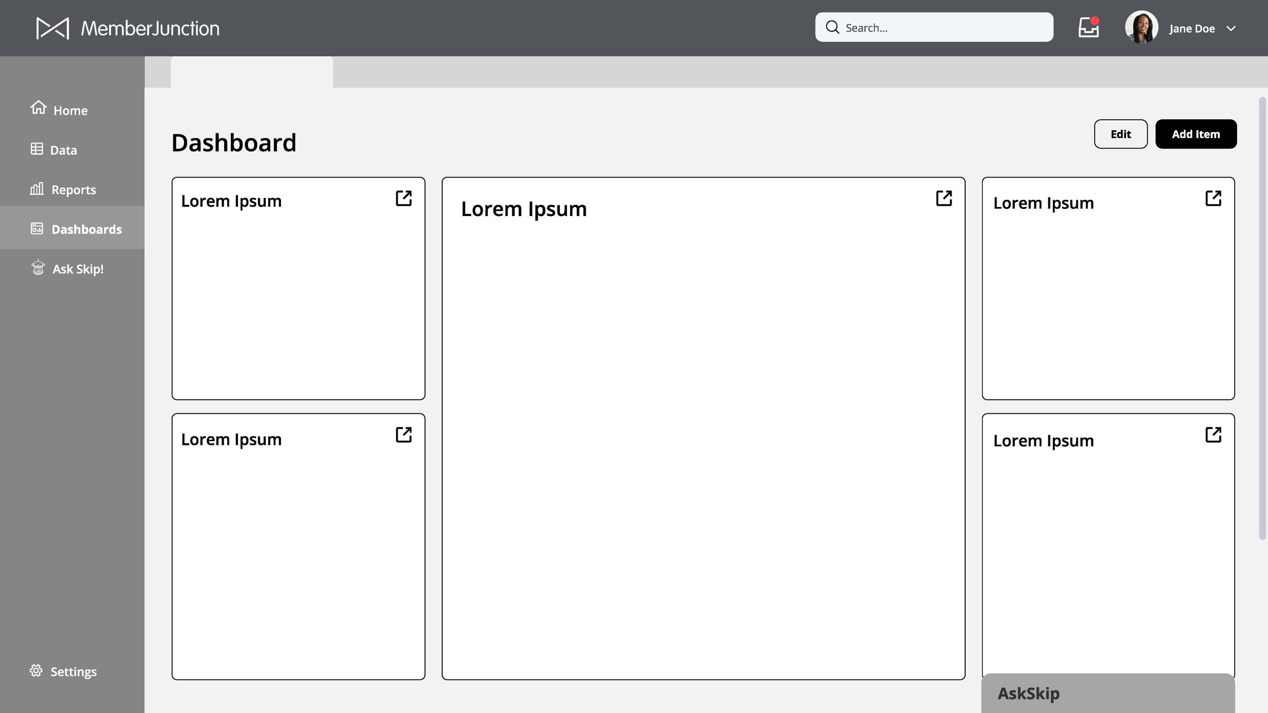
Next, I moved on to low-fidelity wireframes. These were used for further usability testing and allowed me to determine the viability of solutions. For example, a secondary slide-out navigation was introduced as a way-finding tool to easily see how views are organized within user-created folders, which was implemented later in the prototypes after favorable user tests. However, the placement of SkipAI as a slide-up window in the lower right corner was discovered to be too difficult to see when collapsed and not large enough for report generation. Instead, that feature was reimagined as a floating icon that expands into a screen takeover in the prototypes.

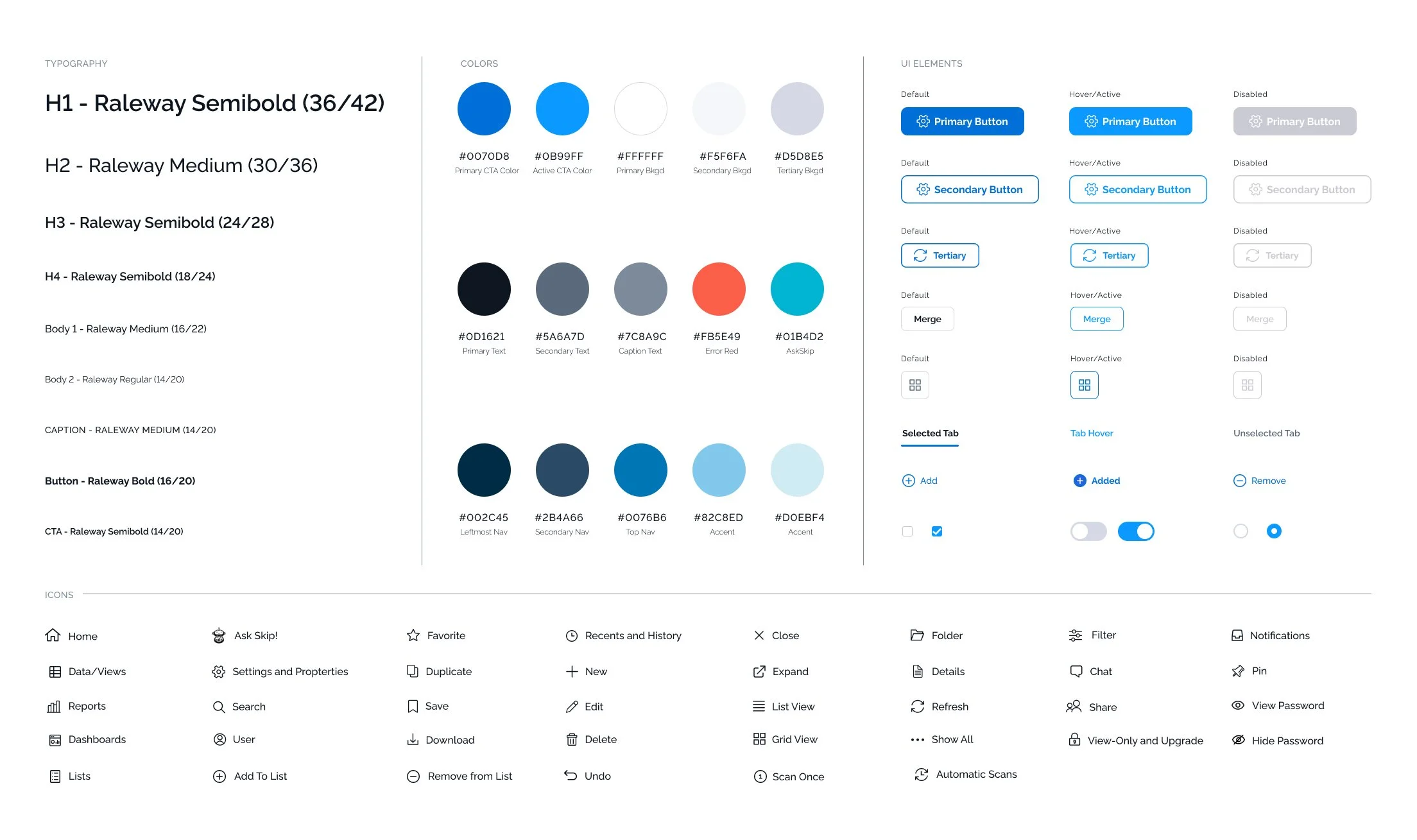
UI Styling
As I started prototyping in the next phase, it was important to create a detailed UI style guide to keep the UI of the product consistent, both for myself as a designer and for the developers moving forward. I created the following system of fonts, colors and elements to provide this product with a professional yet modern look and feel.
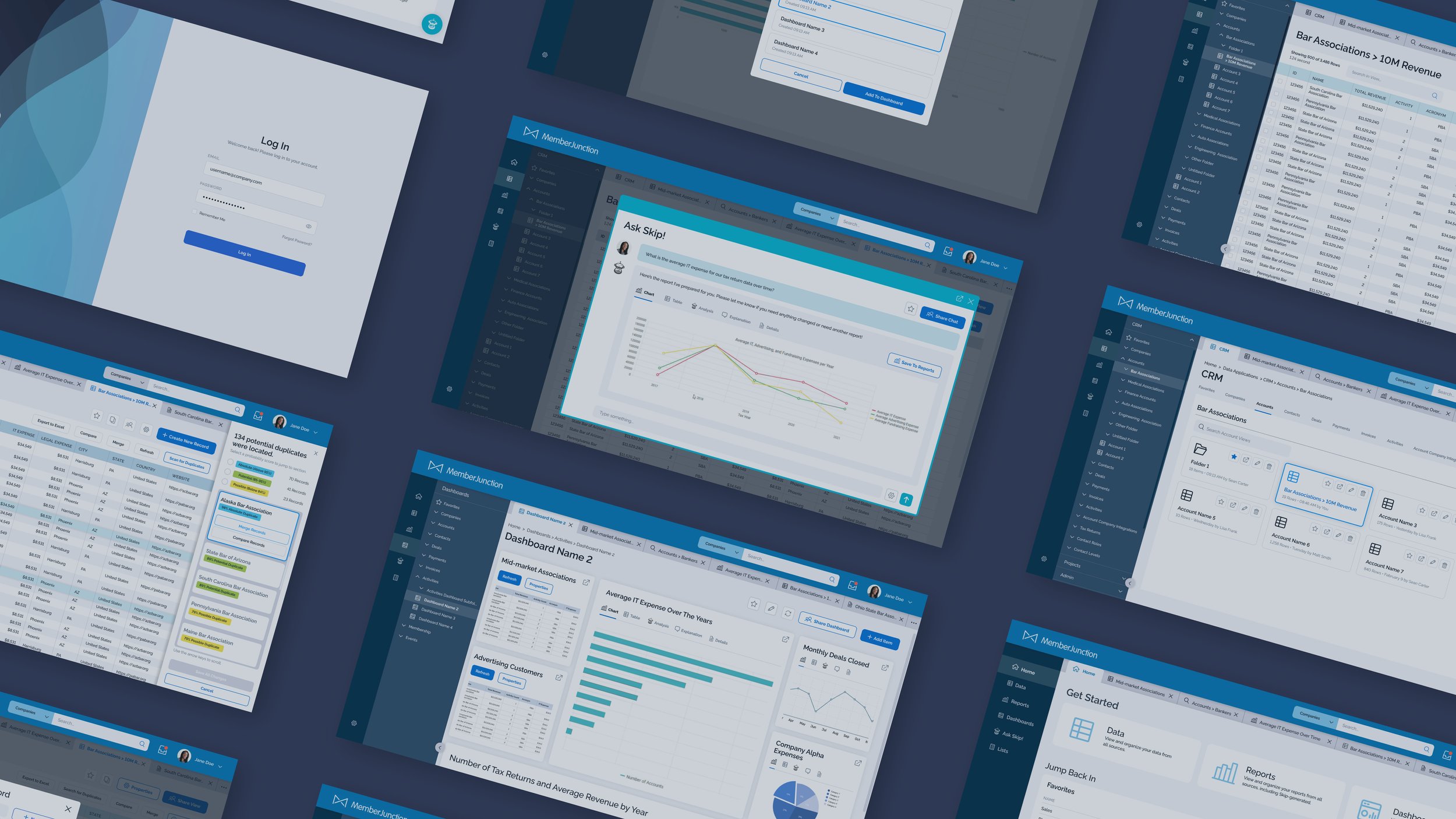
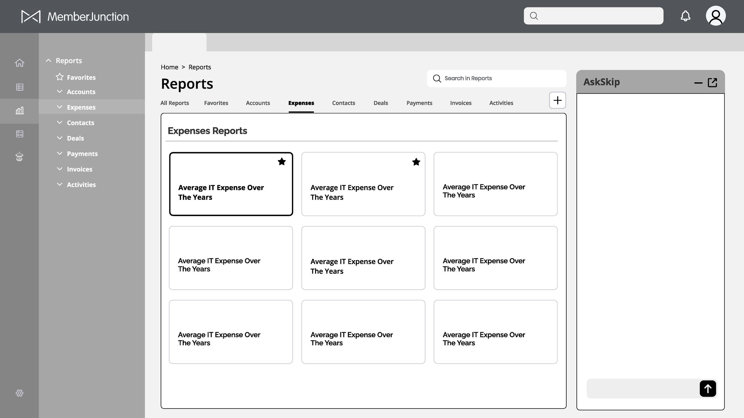
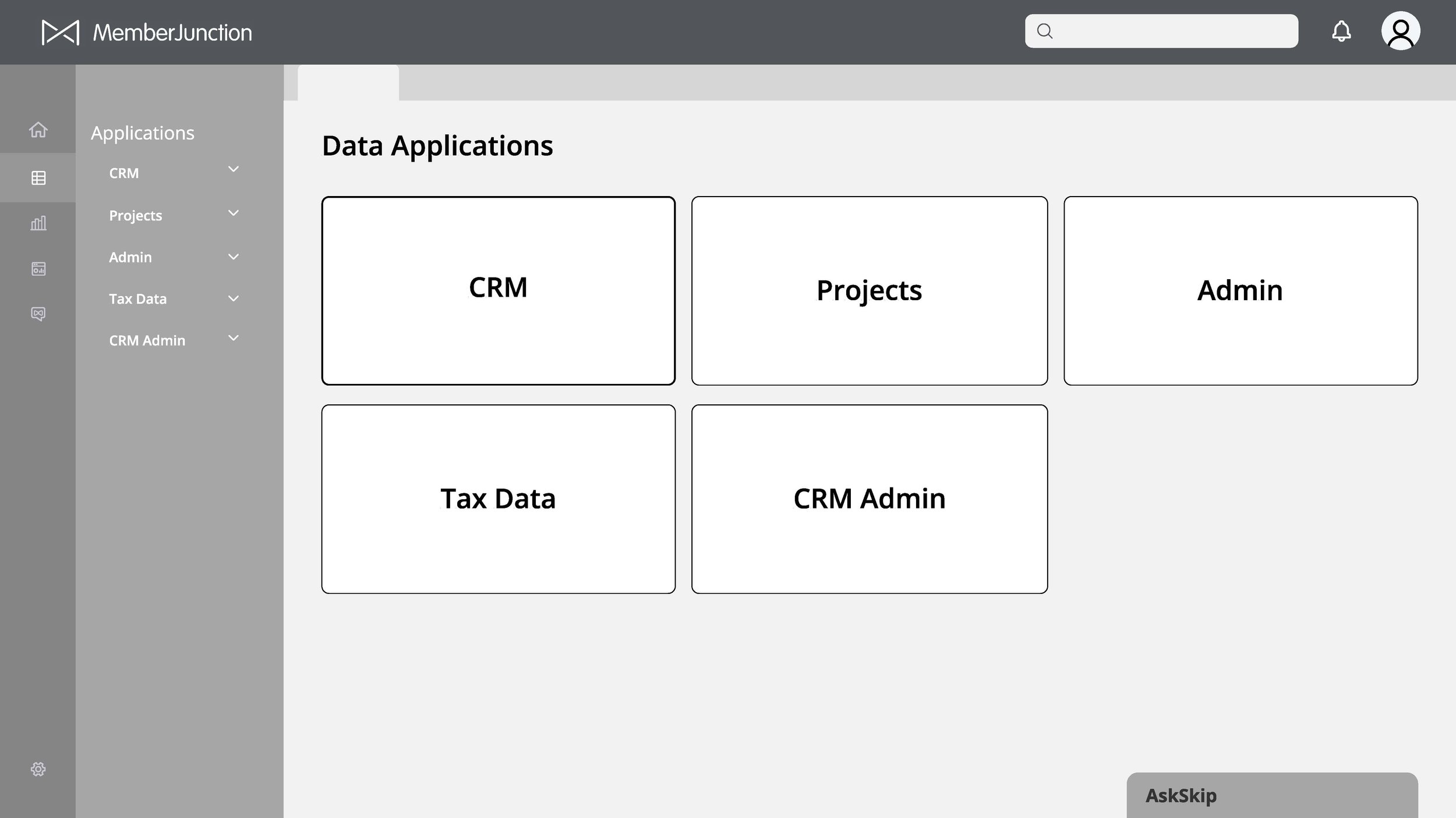
Prototypes
Developed clean, consistent UI elements and styling across the application Created overall hierarchy and prioritization of options presented to the user on each screen to provide a more easily navigable and streamlined experience.
Key Updates:
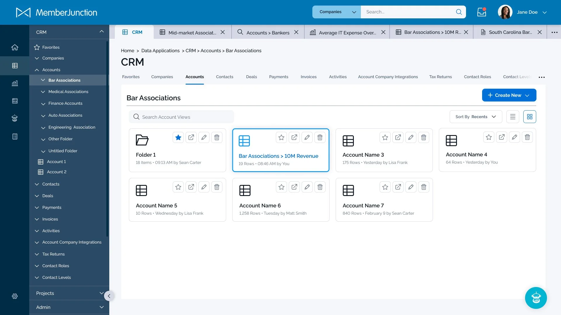
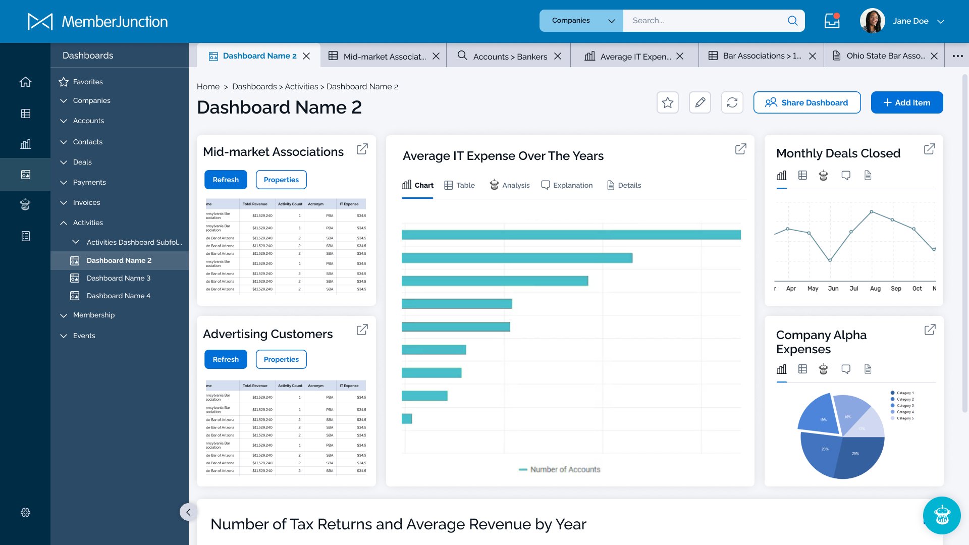
Addition of side panel navigation to easily click between different data sets and see how they’re organized within folders.
Reduced the amount of automatically created tabs by using popup windows for temporary actions.
SkipAI feature is better integrated into the user experience throughout the app.
Added additional UX features such as filters, search, and icon/list toggles.
Added multi-user sharing capabilities.